Getting Started
For this tutorial, we will demonstrate the basics of Yob by plotting the time and distance traveled of a ball rolling across the floor and determining its projected distance traveled as time goes on.
Installation
First thing’s first. If you don’t have Yob installed already, visit our Google Doc add-on store page.
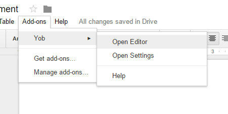
To start Yob, open a Google Doc and select Add-ons > Yob > Open Editor.
The Home Screen
When you open the graph editor, you should see something like this:
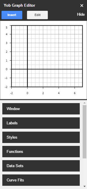
The home screen is organized into two sections: the graph preview, and the main menu. The graph preview can be moved by clicking and dragging, and zoomed by scrolling the mouse wheel. The main menu contains several submenus for managing specific parts of your graph. Let’s start with the Data Set menu.
Plotting Data
Click “Data Sets” from the main menu, then click the + icon to create a new Data Set. Locate the table editor at the bottom of the menu. Here, we can enter the time-distance data from our ball experiment. Here is some sample data that we have supplied for you (you may simply copy and paste this data):
| Time (s) | Distance (m) |
|---|---|
| 1.0 | 1.5 |
| 1.5 | 1.8 |
| 2.0 | 2.3 |
| 2.5 | 2.6 |
| 3.0 | 3.5 |
| 3.5 | 3.7 |
| 4.0 | 4.2 |
| 4.5 | 4.9 |
| 5.0 | 5.3 |
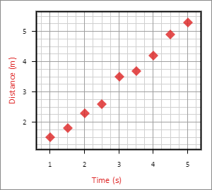
Once entered into the table, the data can be viewed in the graph preview. To automatically fit the window to show all of the data, select the Auto Zoom checkbox.
Next, let’s put proper labels on our Data Set. We will set the xLabel field to Time and the xUnit field to s for seconds, then the yLabel field to Distance and the yUnit field to m for meters.
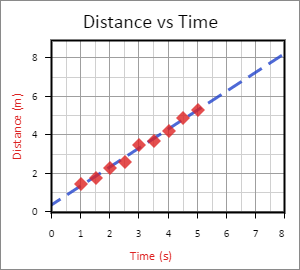
Your graph should now look something like the following:
Finding the Projected Distance
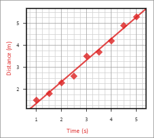
Now that we have plotted the data, we can find the projected distance of the ball as time goes on. To accomplish this, we want to create a Curve Fit, which will calculate the line of best fit, given a Data Set and a model.
Click “Back” to return to the main menu. Then click the Curve Fits submenu, and click the + icon to create a new Curve Fit.
Set the data source of the new Curve Fit to the Data Set we previously created: Data Set 1. Then change the model type from none to linear. Voilà! You should now see the line of best fit for this data on the graph.
Adding the Finishing Touches
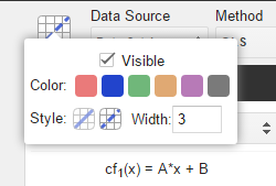
To introduce a little more color on this graph, let’s change the style of the Curve Fit line. To accomplish this, click on the line preview icon near the top of the menu. You will be presented with several styling options. Let’s change the color blue and make the line dashed, like so:
And what’s a graph without a title? A title can be added to the graph back in the Labels submenu. At the top of the menu, enter “Distance vs Time” in the Title field. When you're done, you should have something like this:
Inserting the Graph
Now that our graph is complete, we can send it to the document. To do this, simply click “Insert” at the top of Yob, then select the size of the graph you want to insert. After the graph is added, you may notice that it has a link attached to it. Do not remove this link. This link is how Yob knows where the graph data is stored on your Google Drive account, so that you may edit the graph later if you wish.
If you would like to learn more about how Yob stores graph data, view the data storage reference where we explain this in greater detail.
Check Out the Other Tutorials
Yob is full of great features that are covered throughout our tutorial series. Click the “Next” button above to move on to the next tutorial.